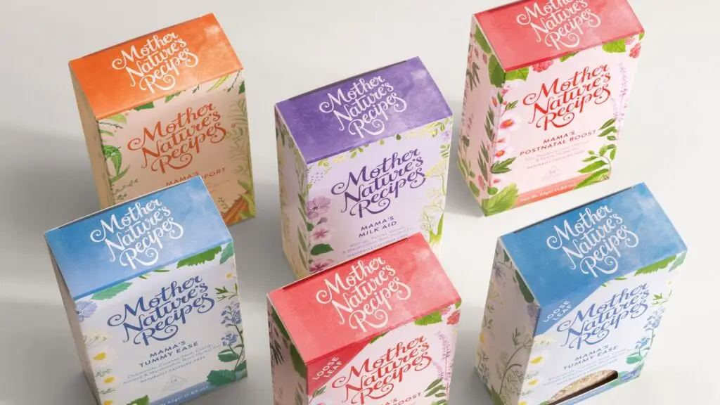
A notable tea company has embarked on a comprehensive rebranding programme with the help of Manchester-based designers.
This rebranding aims to enhance the brand’s positioning in the market and support women through different stages of motherhood.
Introduction of the Rebranding
In an endeavour to strengthen its position in a unique market, a well-known tea company has sought the expertise of Manchester-based designers. This initiative aims to refresh its brand appeal and expand market presence.
Blending teas that cater specifically to mothers, the company is now aiming to support women during various stages of motherhood. The rebranding seeks to visually and emotionally resonate with their target audience.
The Vision Behind the Rebranding
The rebranding initiative is a reflection of the business’s evolution and its goal to foster inclusivity and environmental consciousness. The founder expressed the hope that this new chapter would enable them to support a larger community of mothers.
Motherhood and sustainability are at the core of this transformation. The brand intends to transition to biodegradable materials, showcasing their commitment to environmental stewardship.
Designers’ Perspective on the Project
The creative director from the design firm highlighted the multifaceted nature of the project, stating that it was not just a rebranding exercise but an exploration of maternal experiences.
The design team aimed to enhance emotional connections, focusing on both visual and verbal messaging to convey care and compassion. This approach is hoped to create a stronger bond with consumers.
Old Versus New Packaging
Previously, the brand’s packaging featured a bold, two-coloured design with simplistic fonts. The old logo depicted a mother cradling a baby, aiming for straightforward messaging.
The new design, however, steps away from this simplicity by adopting a more handcrafted appearance. Organic, flowing fonts and creatively curated box designs now epitomize the brand’s aesthetic.
Inspired by the tea ingredients, the new packaging is adorned with intricate foliage patterns, aiming to bring a touch of nature and warmth to the consumer. Each tea box is characterised by vibrant yet subtle colours.
Enhanced Brand Elements
The rebranding introduced several novel elements to the packaging. Iconography representing cups, teapots, and natural elements has been used to enrich the visual narrative.
The ‘garden of eden’ concept was employed to highlight the natural and wholesome ingredients of the teas. Apertured tea boxes now allow consumers to view the loose leaves, enhancing transparency and trust.
The company aims to offer its rebranded products through health-conscious retail chains, hoping that the rejuvenated look will attract a broader customer base.
Targeting New Market Segments
With the newly designed packaging, the company is setting its sights on prominent organic and health food retailers. The aim is to align the brand’s renewed ethos with like-minded distributors.
This strategic shift is expected to widen the brand’s reach, allowing it to tap into new customer segments and enhance brand loyalty.
Conclusion
The rebranding represents an important milestone for the tea company, marking its growth and commitment to supporting diverse motherhood journeys and sustainability.
By infusing care and compassion into their visual and verbal messaging, the brand hopes to build stronger connections with their audience, positioning themselves as a nurturing and responsible choice.
The rebranding signifies the company’s evolution and dedication to various aspects of motherhood and environmental sustainability.
The new visual and verbal messaging aims to forge deeper connections with consumers, reinforcing the company’s caring and responsible image.

